I like books. I like reading, and I’ve always enjoyed learning, and expanding my world view and ideas about things. Doing so makes for a more vivid and expansive world thats full of different possibilities and interesting futures.
And so to keep track of the ideas and thoughts that I come upon, I use the tool of journaling. One day a couple of months ago, I thought that maybe I could make my own pocket notebooks and so this is my go at it.
I’ll go over the different versions (v1, v2, v3) and the different design decisions for each.
V1
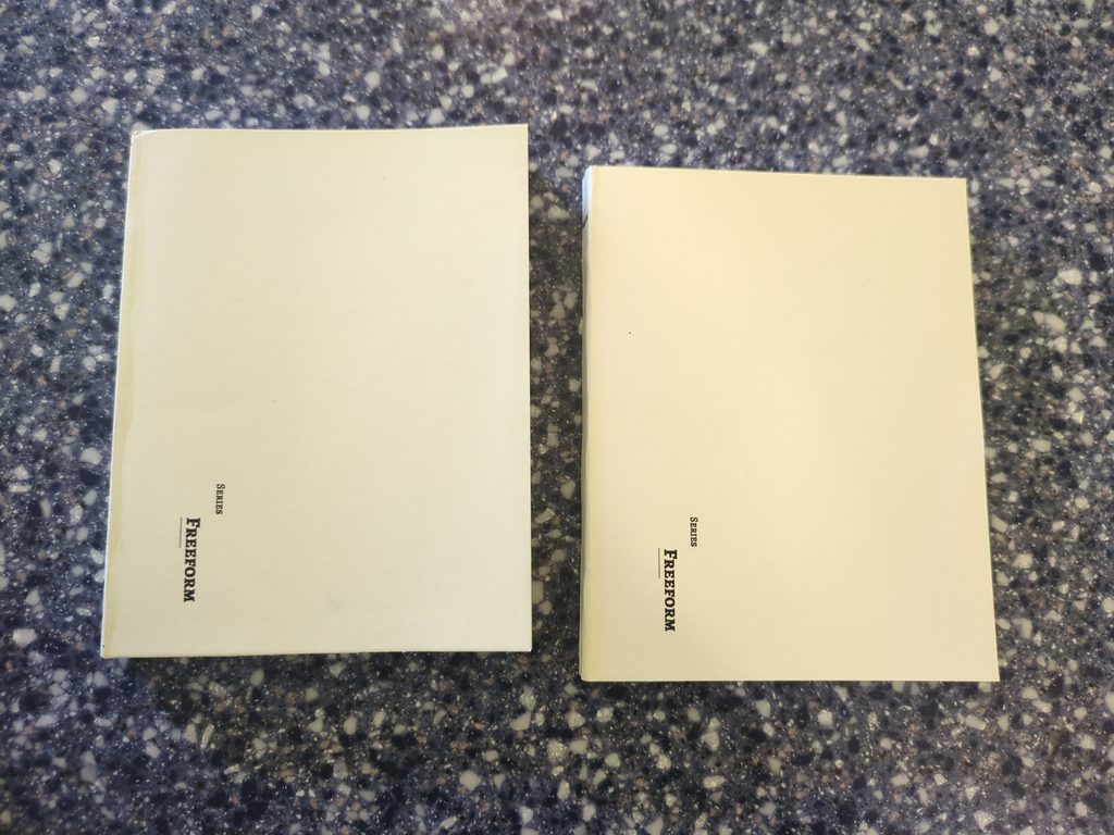
First up is v1. The goal was to make the most basic pocket notebook I could. I used basic copy paper with green cover paper and a medium cardstock cover. The inside was empty pages so I just called it the ‘freeform’ and slapped the title parallel to the spine of the notebook. The process used for this version is the same as all the others versions.
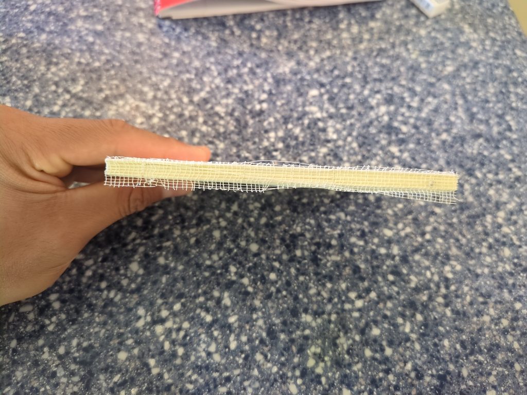
Paper is cut and folded into signatures, holes are punched on each signature, the signatures are then kettle stitched, cover papers are glued on, the whole spine is set and glued, book binding cloth and a strip of paper is then glued to the spine to secure the whole thing, the cover is glued onto the spine, and then the booklet is cut to the dimensions of an A6 paper size (210mm x 148mm).
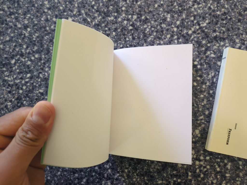
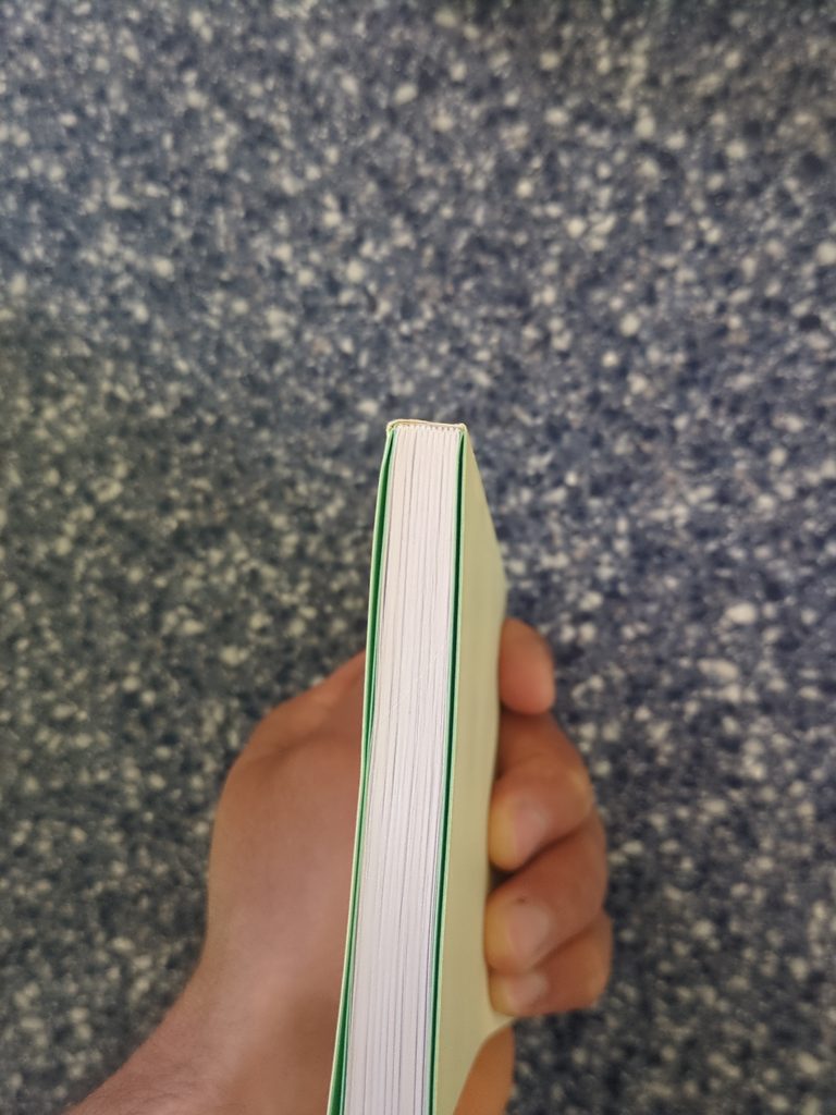
Below you can see an intermediate step where the spine has been glued and gauze has been applied, and besides it you can see how each signature is visible when the notebook is viewed from the top.
V2
For V2 I made a couple of changes. Instead of blank pages I wanted to make the notebooks have a little more of a predefined structure to lend to its utility. There were 2 immediate notebook formats that came to mind: todo lists, and dotted paged notebooks.
2 types of notebooks were then created with the dotted and todo format in mind that I called the freeform, and forge notebooks.
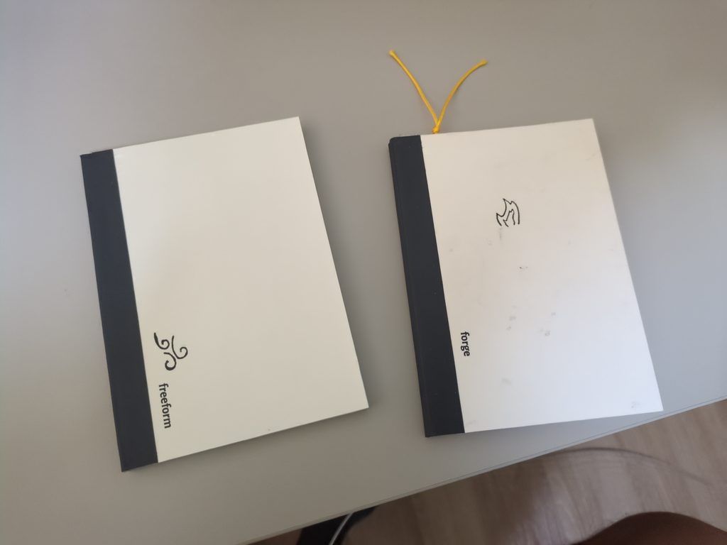
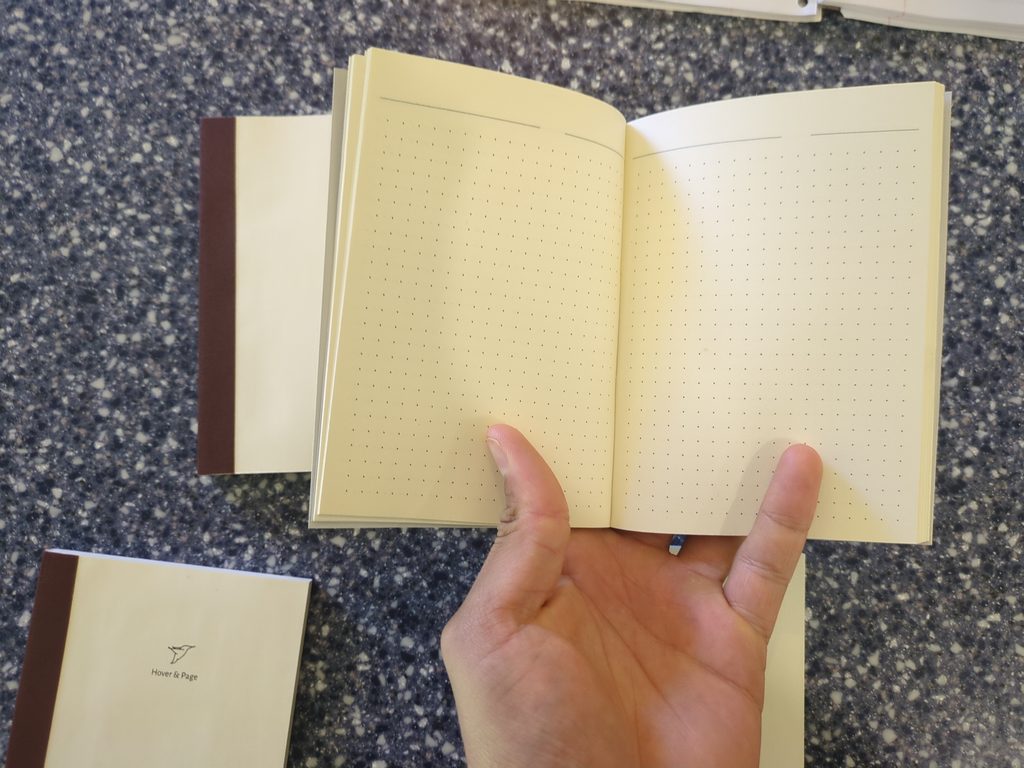
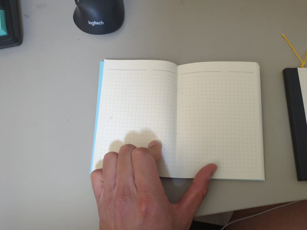
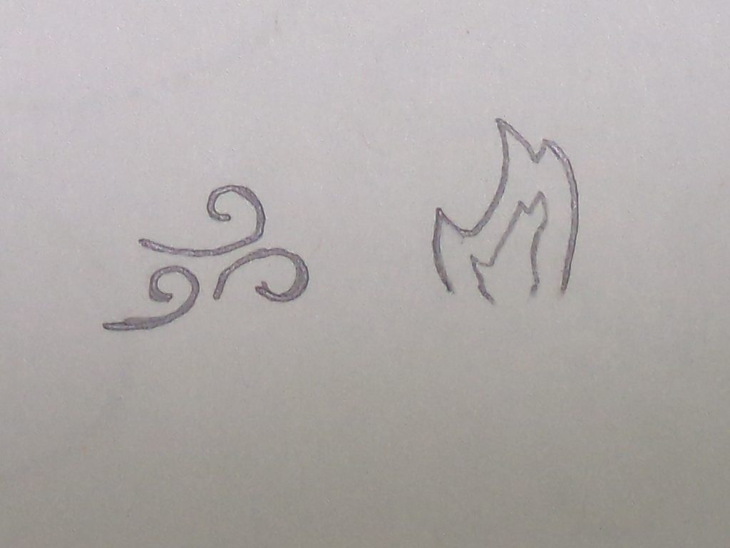
Freeform is the dotted paged notebook as you could have guessed. You can make schedules, compartmentalize the page how you want it, you can use it as guides for drawing, and in general this format is free and easy going. The pages consist of 5mm spaced dots with 2 title lines for any use (date, title, page #, idea, etc…). Thus I used the name freeform, and to imply the free flowing nature of the notebook I made the logo a gust of air – air being the element of freedom. Here it means the freedom of thought, expression, and form. Below you can see an example of the freeform.
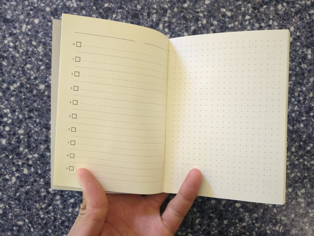
Forge is the name I gave to the todo notebook below. On the left page there’s a todo list of 10 items, and 2 title lines. You can use the todo list for daily todos, groceries, ideas, movies and books, breaking down projects, workouts with reps and sets, etc… A dotted page was added on the right; you can use this page to add more nitty gritty details to anything on your list and it helps to keep each set of pages focused on one subject.
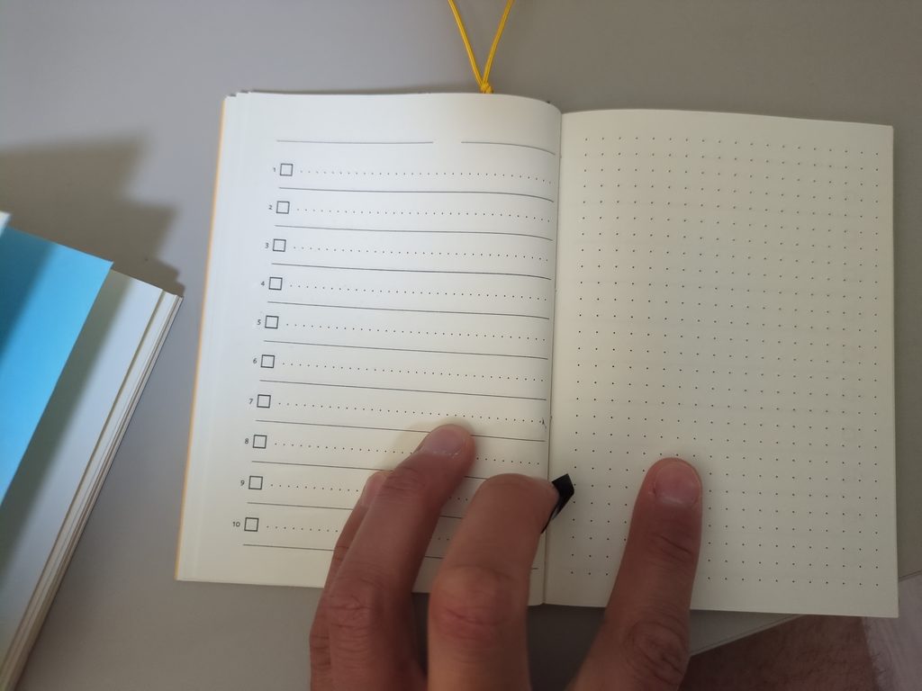
I named this notebook forge and created a fire logo for it. The reason for this is simple. When you do things you are almost certainly working towards the accomplishment of something through your blood, sweat, tears, and time; these ideas are well encapsulated by the fire element which is the element of creation, and transformation, but one in which a fuel and offering is needed to sustain the illumination produced. If you make a fire it always needs an organic fuel source whether that be gas, wood, or coal, and likewise when you are working towards something it requires the sacrifice of your time and efforts; your todo’s are the forge on which you build your thing.
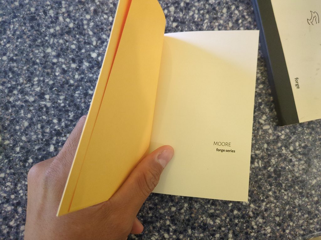
Another goal as I made v2 of the notebooks was that I wanted to make everything by hand. The pages were created through python reportlab scripts and the logos were made by hand then scrubbed and cleaned in affinity. A couple other additions to these notebooks was the use of colored cover paper to further differentiate the kind of notebook you were dealing with: orange for forge, and blue for freeform. There was also the addition of black spine tape and a simple ‘brand’ name on the first page which I used my last name for since it was easy for v2, but this changed for v3. Below you can see the freeform and the forge logos.
V3
I liked how v2 ended up. The page format, the spine tape and cover paper looked good, and now my goal was to refine.
The first order of business was the brand name. Using my last name didn’t cut it and it was only a placeholder of sorts. I had the idea in my mind to look for a new name. One day when I was sitting in my back yard I saw a little hummingbird buzz by the honeysuckle bush to feed; it finished and zipped around the whole lawn exploring its nooks and crannies and then it was off in a flash.
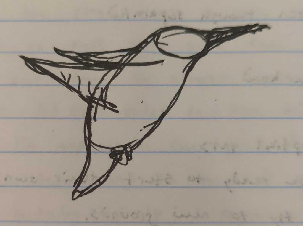
Hummingbirds are amazing little birds and the whole experience reminded me of last summer – my hummingbird year, I call it – when I saw well over 100 hummingbird sightings during my walks at the park and lake. I saw hummingbirds so regularly and in such high numbers that the sightings, in time, did not fail to make an impression on me. When I saw the hummingbird zipping by in the backyard I decided right there and then that the brand name would have something to do with hummingbirds. I set to work and drew the hummingbird below and settled on the name ‘Hover & Page’ – the hummingbird being the only bird capable of hovering.
I thought the name was especially fitting. The visage of a hummingbird lends itself to the imagery of Hermes the Greek messenger god of Olympus with his 2 winged sandals flying freely between the divine realm of Olympus and the mortal realm of men below. Likewise in native American and indigenous American legends of old we see the hummingbird as a symbol and as a messenger between the divine and the mortal realms.
In the Mayan Jade Arrow Legend, the gods forget to make an emissary between the heavens and mortal men, and since they ran out of clay they instead carve a piece of jade into the shape of an arrow and blow life into it; the jade shard comes to life and it transforms into a hummingbird that quickly darts away. The hummingbird forever more acts as the messenger of human desires, thoughts, and prayers and takes them up into the divine realms and likewise it sends messages from the dead and from the gods down to man.
My whole idea with the hummingbird as the logos of the brand was that writing, drawing, and notes are all a divine act of creation where you take feelings, inspirations, and ideas from above, which you then give shape and form too, and finally you transplant them here into the world as something material and with substance.
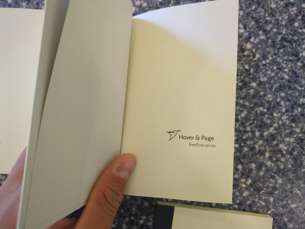
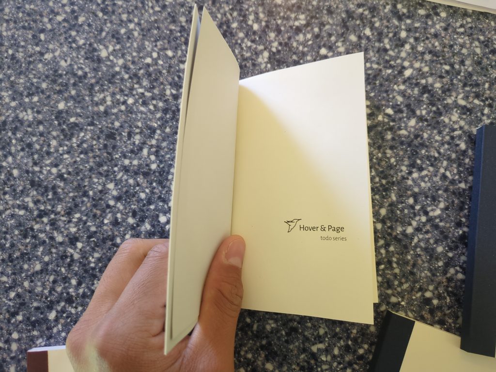
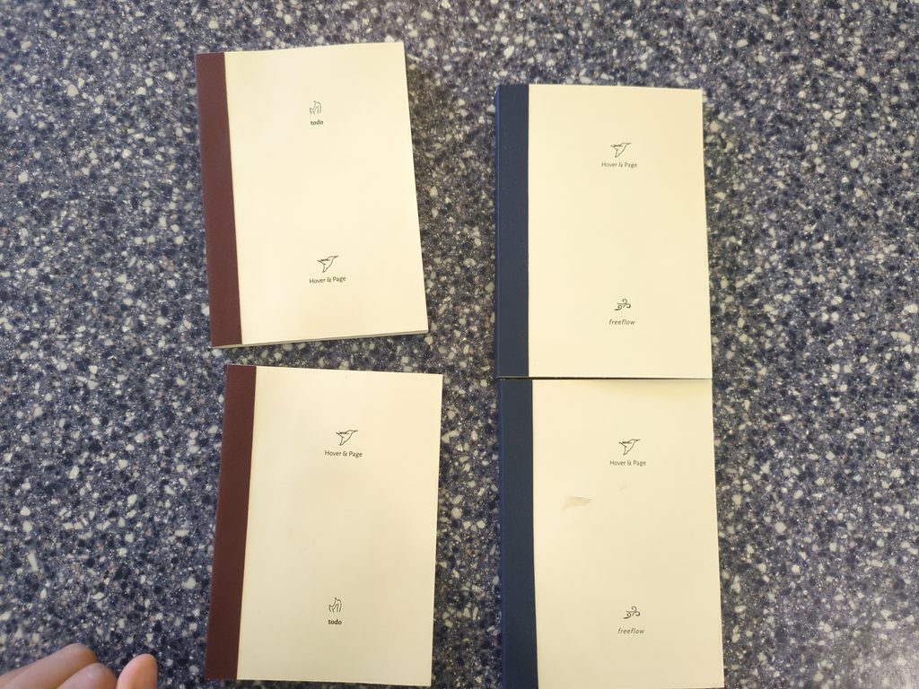
A couple of new changes were made for v3 seen down below: the ‘forge’ name was renamed to ‘todo’, the spine tape color now corresponds to the todo notebook which is maroon colored or the freeform notebook which is navy colored, the cover has been updated with the brand and the type of notebook, the cover papers are now both gray, the logo and brand has been updated on the first page, and finally the todo list numbering is now ‘0’ based indexing so if you have, for example, 20 items you can go to the next page and prefix the item list with 1, where 0 becomes 10, 1 becomes 11, 2 becomes 12, etc…